 So, the ladies of the Creature Comforts blog have created an online holiday Gift catalogue called Gifted Magazine. This thing is awesome. It's full of DIY projects, tons of shopping ideas and features bios of little boutiques. And, of course, it's beautifully designed. You have GOT to check this out!
An Ornamented Life
Cool Stuff
Cool Stuff From a Love of Motherhood, Scrapbooking, & Decor
Thursday, November 4, 2010
Gifted
 So, the ladies of the Creature Comforts blog have created an online holiday Gift catalogue called Gifted Magazine. This thing is awesome. It's full of DIY projects, tons of shopping ideas and features bios of little boutiques. And, of course, it's beautifully designed. You have GOT to check this out!
Flowers
 I've seen TONS of homemade flower embellishments lately. It seems there are innumerable ways to create your own paper flowers. I saw the flowers to the right on the Scrapbook Circle blog. The one below is made from a snowflake punch, but it's kind of flower-like. I saw that one on the Pink Paislee site.

The rolled-type of flower illustrated above looks good and is so easy; I've done it several times myself. This example I found on The Color Room site.

Also found on The Color Room site is the layered flower on the left made using a layer of fabric, paper and then a purchased flower.

Of course, Elizabeth Kartchner is probably the most awesome at this (see her layout to the right). Her scrapbooking blog is a veritable feast of bright frilliness and I love looking at it for the total eye-candy factor.
Tuesday, November 2, 2010
Merry and Bright


So simple, yet stylish: jars filled with colored ornaments!

Framing a wreath hanging on the wall? I wouldn't have thought of it, but I like the look.

Don't forget to decorate your lighting!

I love this simple and sweet look of buttons threaded with wire and topping a present.

Easy to make your own pedestals using candlesticks and pretty plates.

I'd definitely like to try this at Christmastime: hanging cards by twine and plain office clips.

I wouldn't exactly use this design, but I'm loving this idea of trimming the edges of my china cabinet shelves using patterned paper and double-sided tape.

A simple and cheerful way to display your holiday cards: making them into a wreath.

Put a sweet trim on your doors by using satin ribbon and dried flowers.
Monday, November 1, 2010
Chasing Fireflies
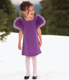
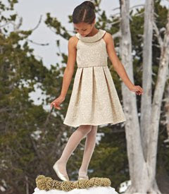
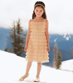
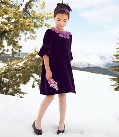
I got a catalogue last week from a children's boutique called Chasing Fireflies. It has got the CLASSIEST kid's dress clothes I've ever seen. They can be a bit pricey, but they sure are cute. I thought their little girls' dresses were the most adorable classy stuff ever!


Dip Dying a Lampshade
 I did this super easy project on a bland, inexpensive lampshade. All you need is:
- a box of Rit dye (take a look at the Rit Color Guide)
- a big bucket (bigger than your item to be dyed)
- water
I used an empty Scoop Away bucket and dropped the dye in. Then, I filled the bucket with water (using hot water will enable the dye to dissolve better). This created a dark-looking dye. I placed the white lampshade into the bucket and left it for 1/2 hour to an hour. How long you leave it contributes to how dark the color on your item will be. Then, I emptied a quarter of the water out of the bucket and replaced the lampshade. I left it another stretch of time before emptying another quarter to half of the remaining water and returning the lampshade to the bucket one last time. Finally, I took the lampshade out of the bucket and set it to dry emptying my bucket of dye completely. [How much water you empty each time will determine where your gradients are. I wasn't really that particular, but if you want evenly separated sections, you need to be more exact about emptying your water and do it in the same increments.]
I ended up with a light grey dip-dyed shade. I was really pleased with the results. I would have liked it a bit darker, but to achieve that I would have had to have more dye or left it in the dye longer (I'm impatient, what can I say?).

Wednesday, October 27, 2010
Freezer Paper Stenciling
 This is an easy project with wonderful results. You need the following:
- freezer paper (found at most grocery stores)
- fabric paint
- a craft knife
- a sponge brush
Here's how I did it:
1. Draw your stencil on some freezer paper (I got some ideas from a children's book or you can get stencils from Google Images) and cut out the image with a craft knife leaving at least an inch or two of paper outside of image.

2. Iron a piece of freezer paper (as big as your stencil) to INSIDE of garment (shiny side facing fabric). Then, iron your image to outside (again, shiny side facing fabric). This causes the freezer paper to stick together and avoid moving while painting.
3. Using a sponge brush, brush on fabric paint evenly (I've seen cool examples where the image was layered and different colors used).
4. Let dry at least 6 hours and then slowly peel off freezer paper.
5. Do not wash for 72 hours.

Tuesday, October 26, 2010
Online Scrap Classes
 I just discovered Big Picture online classes. Nic Howard is offering one starting Thursday and I really like her. They also offer workshops and self-paced projects. I'd love to give Nic's class a go, but I'm already doing Tam's free online Art, Heart & Healing class and I want to do Ali Edwards December pre-made book idea as well. So much to do and we're already embarking on a very busy season. How much can I fit in?
Stamping
 I don't do a lot of stamping. I have a lot of stamps. I think I just often forget to use them or they seem like work or something. But I was visiting my friend Kristen Dunker's blog Cottage Stamping where she posts beautiful examples of her work, like the card to the left. I just love those paisley stamps. Now, I'm thinking I need to get some more stamps and work on incorporating more stamped images into my scrapbooking. The online catalogue she has posted on the blog has many wonderful stamps that I would love to utilize. If I spent some money on some fine stamps would that motivate me to use them?
Handprints

I LOVE this idea I saw on Becky Higgins' blog about turning your child's handprint into a cool work of art. Using a small canvas and acrylic paint, she records her children's prints yearly (see pic). I like the colorfulness of this idea. I don't think I'd do it yearly because I don't know where I'd put them all, but I'd like to try it at least once.
Monday, October 25, 2010
Baby Hair
 Ever since my baby girl has had enough wisps of hair in which to put some head ornamentation, I've loved hair flowers. I like to buy adult hair accessories and make them work for mygirl. I love these fabric flowers from Whippy Cake that I saw on Becky Higgins' blog.
The following pictures depict my Chrislyn wearing adult-sized hair accessories. It's surprising to me how many adult hair things fit little ones.


Many headbands for adults fit little heads.


The crocheted flowers on the left were made by my mom. These seem very trendy right now. The black net-like headband is adult.


There's lots of flower options. I like more real looking flowers like the one near left that I cut off of an adult headband. The feather clip far left I got off ebay. As my little one is a toddler, it takes up a large portion of her head, but is so cute.


These barrettes are adult-size. I may have found them in a junior section.


The headband and the jeweled bobby to the left are Goody products purchased in the adult section.
Holiday Tees
Two More Place Mat Pillows!
Thursday, October 21, 2010
New Stuff
 I love the look of Basic Grey's Curio Collection. Tammy Tutterow did some amazing stuff with this collection on her blog. Love it. Love it. Love it.
I'm really liking Karen Foster Designs' 3D Peek-A-Box. I would love to get this and design it for Christmas. This would be such a fun project and I know the kids would love the anticipation of peeking into a box a day.


Now, the December issue of Scrapbooks, Etc. had "A Month of Memories" article by Ali Edwards about creating a December album. I am loving this idea and I think I'm going to get on that bandwagon this year. She gives ideas for creating a holiday-themed album. She encourages one to create the album ahead of time and then when December rolls around, you just need to pop in the pictures and the stories. I would definitely need to do it ahead of time in order to get it done because the holidays are so busy and just rush right by. Anyone else interested in this idea?
Wednesday, October 20, 2010
Stuck...Or Not?

I feel a bit stuck, scrapbooking-wise. I do challenges weekly with a friend and I'm always designing and executing new pages, but I feel like I've been doing the same style for so long and that it's boring. I don't know how to break out of doing the same old thing. And I'm not sure how much of it is a rut and how much is just how I THINK--my style. I'm a linear thinker, which is obvious in my scrapbooking--it's almost all linear. I like things lined up, straight, orderly. Do I need to change if I'm almost always doing the same thing? And HOW does one DO that? I LIKE other styles when I see them. I WISH I could design like that, but even when I try, it's like my brain doesn't DO that and in order to accomplish something different I need to almost exclusively scraplift. Should I just take my linear style and run with it--do all my linear layouts that come easily to me or try to challenge myself to do something completely different even though it's hard and takes SO much longer?
Subscribe to:
Comments (Atom)


